
- An effective infrastructure monitoring dashboard should focus on golden signals like CPU, memory, and disk I/O.
- Simple Observability is the best choice for teams needing a fast, lightweight dashboard with unified metrics and logs.
- Datadog and Dynatrace are powerful for enterprise scale, while Grafana remains the industry standard for custom visualizations.
Most infrastructure monitoring dashboards fail because they show too much data. You spend hours staring at hundreds of charts, but when a server actually goes down, you still have to dig through logs to find the cause.
A dashboard shouldn’t just be a wall of metrics. It should be a tool that highlights bottlenecks before they become outages. Whether you are managing a single VPS or a massive hybrid cloud environment, visibility is your first line of defense.
How do you build a dashboard that actually helps you solve problems? Here is a guide on the best practices and the tools that can help you get there.
What should be on your infrastructure dashboard?
The secret to a good dashboard is focus. Instead of tracking every single process, you should focus on the metrics that indicate the health of the host itself. These are often called “golden signals.”
CPU and load average
Monitoring CPU usage is basic, but load average is often more important. It tells you how many processes are waiting for CPU time. A high load average on a low-CPU system usually points to disk or network bottlenecks.
Memory usage and swap
If your server starts swapping, performance will tank. Your dashboard should clearly show available memory and swap activity. Constant swapping is a clear sign that your application needs more resources or has a memory leak.
Disk space and I/O throughput
Running out of disk space is a preventable disaster. You need to monitor both the percentage used and the I/O throughput. High disk latency can slow down your entire stack, even if the CPU is idle.
Network throughput and errors
Spikes in network traffic can indicate a DDoS attack or an application misconfiguration. Monitoring error rates on your network interfaces can also reveal hardware issues or cabling problems in on-premise setups.
Infrastructure monitoring dashboard tools summary
| Tool | Best for | Price |
|---|---|---|
| Simple Observability | Small to mid-sized teams needing speed | From $9/month |
| Datadog | Large enterprise environments | Usage-based (expensive) |
| Grafana | Advanced custom visualizations | Free (OSS) or SaaS |
| Dynatrace | AI-powered automation | Tiered enterprise pricing |
| New Relic | Unified APM and infrastructure | Per-user pricing |
Reviews
Simple Observability
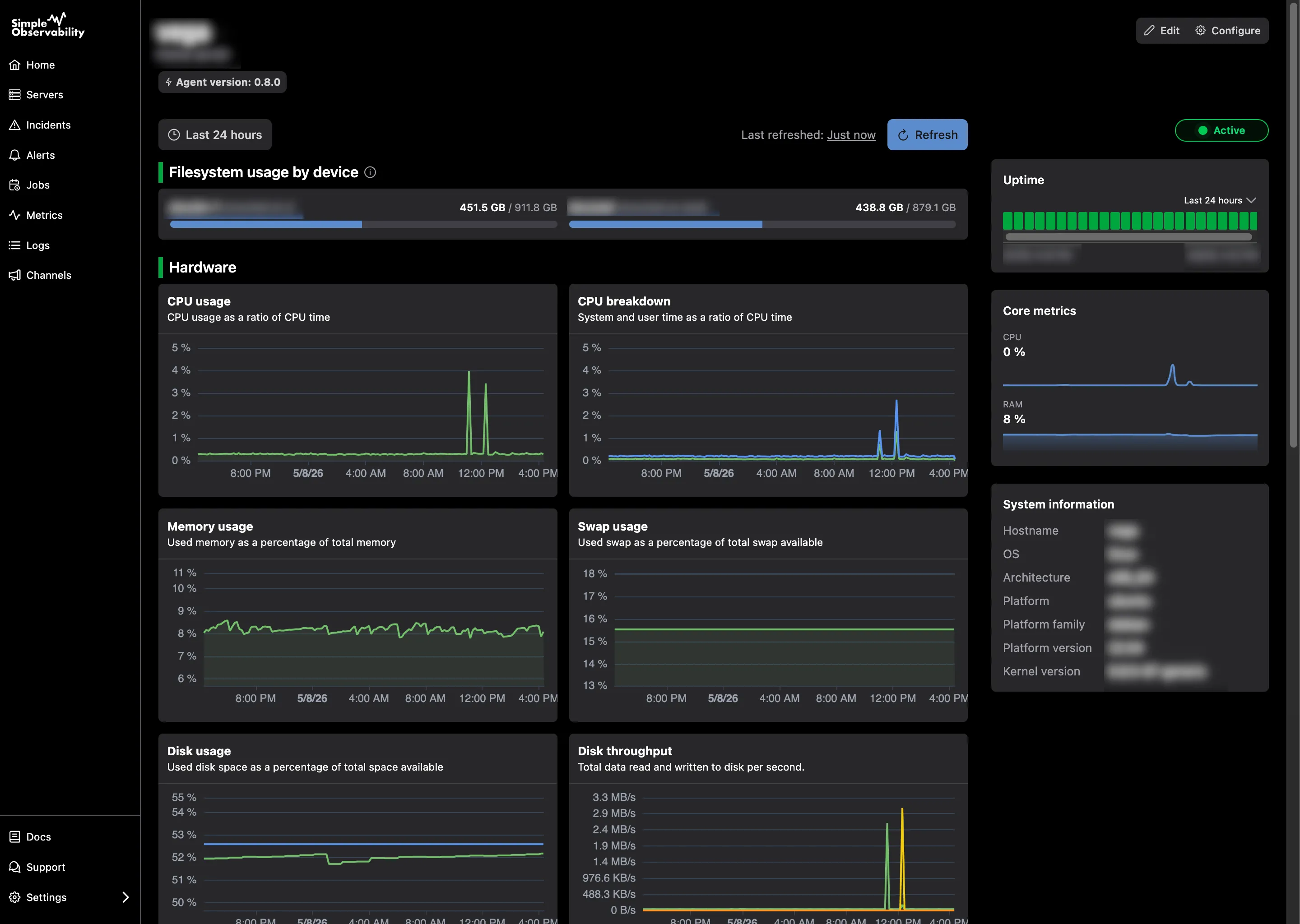
Simple Observability is built for speed. It is a modern monitoring platform that combines metrics and logs into a single, unified dashboard. It is designed to be the fastest way to get visibility into your infrastructure without the overhead of “big ops” tools.
The installation takes less than a minute with a single command. Once the agent is running, it automatically populates a dashboard with the most critical health metrics. You don’t have to spend days configuring charts or writing complex query languages.
It is particularly useful for teams who are tired of switching between different tools for logs and metrics. Simple Observability puts them on the same screen, making it easy to see exactly what was happening in the logs when a metric spike occurred.
Key features
- One-command agent installation for most Linux distributions.
- Unified dashboard for metrics and logs.
- No-code configuration via a web interface.
- Progressive Web App (PWA) for monitoring on the go.
Pros
- Extremely fast time-to-value (setup in under 60 seconds).
- Transparent, flat-rate pricing that scales with your server count.
- Open-source agent that is lightweight and secure.
Cons
- Fewer deep custom visualization options compared to Grafana.
Best for: Teams who want a powerful, reliable dashboard without the configuration headache of enterprise tools.
Price
Simple Observability offers a free tier for one server. Paid plans start at $9 per month for 3 servers, with clear pricing for additional nodes.
Datadog
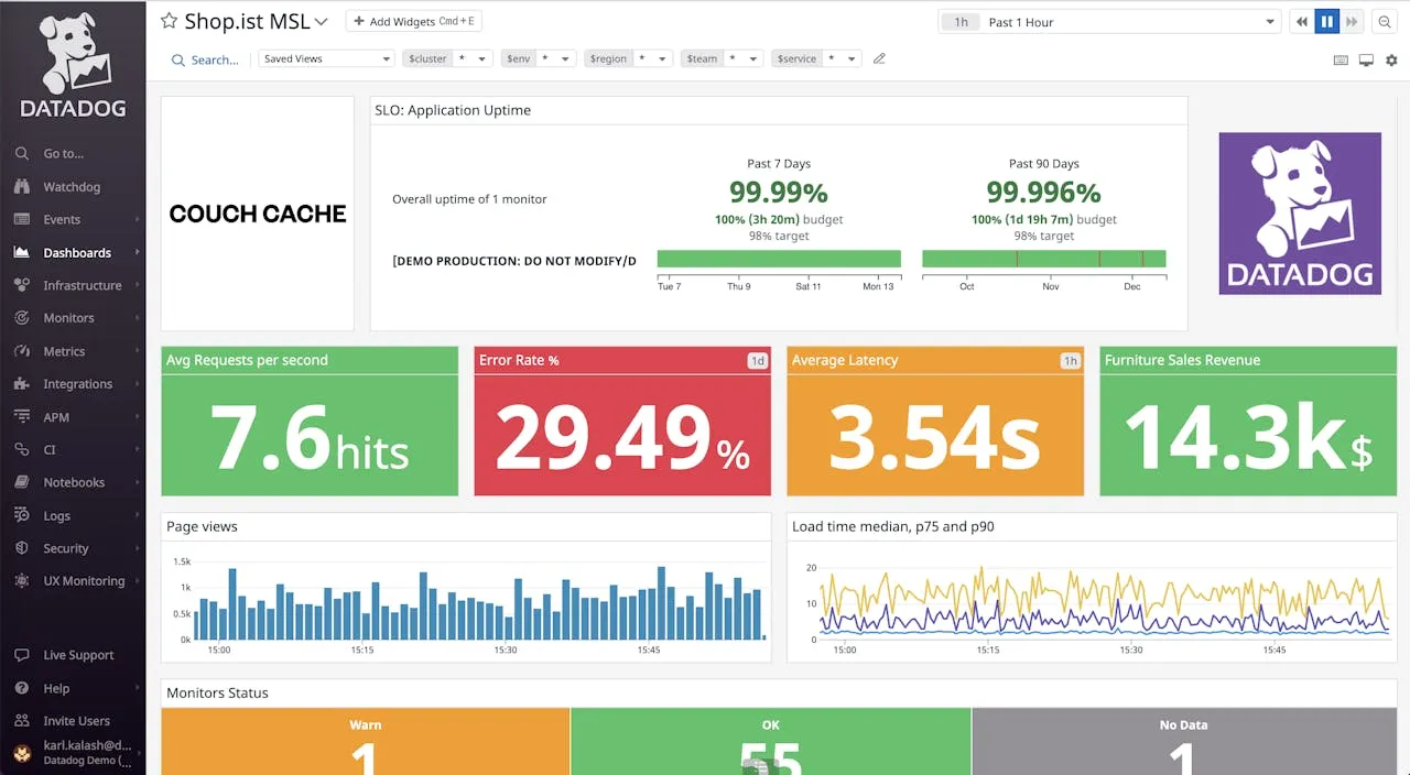
Datadog is the heavy hitter in the observability space. It provides a massive range of integrations and a highly flexible dashboard system that can pull data from almost any cloud provider or database.
Its infrastructure dashboards are incredibly detailed. You can slice and dice your data by tags, regions, or host groups. This makes it a great choice for companies running thousands of instances across AWS, Azure, and Google Cloud.
However, that power comes with a price. Datadog’s pricing model is notoriously complex and can become very expensive as you scale. It also requires a significant amount of time to master and configure correctly.
Key features
- 600+ built-in integrations for every part of your stack.
- Advanced tagging and filtering for complex environments.
- Automated anomaly detection and forecasting.
Pros
- Industry-leading depth of features and integrations.
- Highly scalable for massive infrastructure footprints.
Cons
- Complex and unpredictable usage-based pricing.
- Steep learning curve for advanced configurations.
Best for: Large enterprises with complex, multi-cloud environments that have the budget and personnel to manage a high-end tool.
Price
Infrastructure monitoring starts at $15 per host per month, but costs quickly increase with additional features like log management and APM.
Grafana
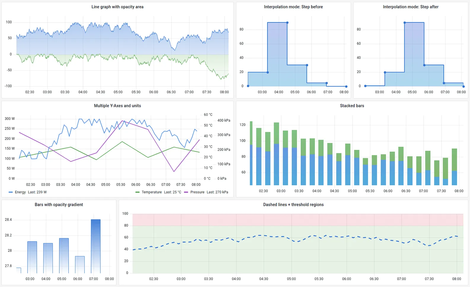
Grafana is the gold standard for visualization. It doesn’t store data itself; instead, it connects to data sources like Prometheus, InfluxDB, or CloudWatch to build beautiful, highly customized dashboards.
If you have very specific requirements for how your data should look, Grafana is the tool for you. You can build almost anything, from simple line charts to complex heatmaps and geographical maps of your server locations.
The downside is that Grafana is just one piece of the puzzle. You still need to set up and maintain the data storage (like Prometheus), which can be a full-time job for a DevOps engineer. Grafana Cloud offers a managed version to reduce this burden.
Key features
- Unmatched customizability and dashboard templates.
- Support for dozens of different data sources.
- Strong community with thousands of shared dashboards.
Pros
- The most powerful visualization engine available.
- Open-source version is free and highly capable.
Cons
- Requires significant manual setup for the underlying data sources.
- Can be overwhelming for users who just want a standard dashboard.
Best for: Users who want total control over their dashboard design and are comfortable managing their own data pipeline.
Price
The open-source version is free. Grafana Cloud has a free tier and paid plans starting around $8 per month for small teams.
Dynatrace
Dynatrace positions itself as the “intelligent” observability platform. It uses an AI engine called Davis to automatically discover your infrastructure and identify the root cause of performance issues.
Its dashboards are designed to be “hands-off.” Instead of you looking for spikes, Dynatrace tells you when something is wrong and why. This automation is perfect for teams who don’t have the time to manually build and watch dashboards.
Dynatrace is a premium product with a price tag to match. It is designed for large organizations that value automation and root-cause analysis over manual customizability.
Key features
- OneAgent technology for automatic discovery and monitoring.
- Davis AI for automated problem detection and root-cause analysis.
- Full-stack monitoring from the host to the user session.
Pros
- Automation reduces the need for manual dashboard creation.
- Deep root-cause analysis saves time during incident response.
Cons
- High entry price makes it inaccessible for many smaller teams.
- The interface can be overly complex due to the sheer volume of data.
Best for: Enterprises that want an automated, AI-driven approach to infrastructure health.
Price
Infrastructure monitoring starts at $0.04 per hour for an 8GB host, which translates to roughly $28 per month.
New Relic
New Relic offers a unified data platform where you can store all your metrics, logs, and traces. Its infrastructure dashboards provide a clear view of your hosts and containers, with a focus on how they affect your application performance.
One of the unique aspects of New Relic is its per-user pricing model. This can be more predictable than host-based pricing for some teams. The platform also includes powerful query tools (NRQL) that let you build custom charts from your data.
While powerful, New Relic has faced criticism in the past for a confusing UI. Recent updates have improved this, but it still feels like a massive, complex system that takes time to learn.
Key features
- Unified data platform for all observability telemetry.
- NRQL query language for custom data analysis.
- Deep integration between infrastructure and application metrics.
Pros
- Generous free tier (100GB of data per month).
- Per-user pricing can be more cost-effective for some organizations.
Cons
- UI can still feel cluttered and difficult to navigate.
- Data ingestion costs can become a surprise if not monitored closely.
Best for: Development teams who want a single platform for both APM and infrastructure monitoring.
Price
Includes a free tier. Paid plans are based on data ingestion ($0.30 per GB) and the number of full-platform users.
Buyer’s Guide: How to choose your dashboard tool
Choosing the right tool depends on your scale and your team’s technical expertise. Before you commit to a vendor, consider these three factors.
Ease of setup
If you need a dashboard today, look for tools with a “one-agent” or “one-command” setup. Simple Observability and Dynatrace excel here. If you have a dedicated DevOps team that can spend weeks on configuration, Grafana and Prometheus are viable.
Unified data
Avoid “tool sprawl.” A dashboard is much more effective if it shows logs and metrics in the same place. This allows you to correlate a spike in CPU usage with a specific error log entry without jumping between tabs.
Cost-to-value ratio
Don’t pay for enterprise features you don’t use. Many “Big Ops” tools charge for advanced AI and complex integrations that small to mid-sized teams simply don’t need. Start with a lightweight tool and only move to an enterprise solution when you hit its limits.
Conclusion
An infrastructure monitoring dashboard is only as good as the action it prompts. A dashboard that shows 500 green lights is useless if it doesn’t turn red when a disk is failing or a service is hanging.
Start by identifying your golden signals. Build a dashboard that highlights those metrics clearly. If you are looking for a fast, reliable, and easy-to-use solution, start with a tool like Simple Observability and iterate as your infrastructure grows.