
At the core of Simple Observability, our backend spends most of its life talking to metric (and log) stores. It’s a simple pipeline: agents push data and the platform stores and processes it.
But testing in these environments requires data that looks and behaves like the real thing. For a long time, we relied on a fragile mix of hardcoded data, static data files, and a handful of internal servers running real agents just to keep our testing dashboards populated.
The friction was everywhere. Adding test coverage meant manually sourcing, saving, and integrating data chunks. Deployments slowed down because new features required manual sanity checks, forcing new versions to rot in staging longer than what we would have liked.
Even demos became a problem. We wanted nice, realistic demo accounts, but without exposing real servers or leaking customer data. We needed a way to generate realistic data on the fly.
The idea wasn’t exactly a revelation. We’d been talking about building a simulator for some time. A black box that we could query and get back something that looked like real telemetry.
But we didn’t just want a script that spat out random numbers. Our open-source agent, simob, is constantly evolving with support for new metric sources. If we built a rigid mock system, we’d end up maintaining two separate sources of truth: one for the real agent and one for the simulation.
We needed a system that could “plug in” to our existing architecture. It had to be:
- Deterministic: for unit test stability
- Extensible: adding new metric sources should be easy
- Expressive: we should be able to control what data we want to see from the simulator
The math approach
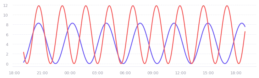
Generating fake time series isn’t hard. If you want a dashboard that looks “busy”, you start with the basics: the sine wave.
y = AMPLITUDE * sin(2 * pi * FREQUENCY * t + PHASE)By varying the amplitude and shifting the phase, you can generate waves that look great on a demo dashboard. But they are too perfect. They lack the specificity and the “messiness” of the telemetry we see in the real world.
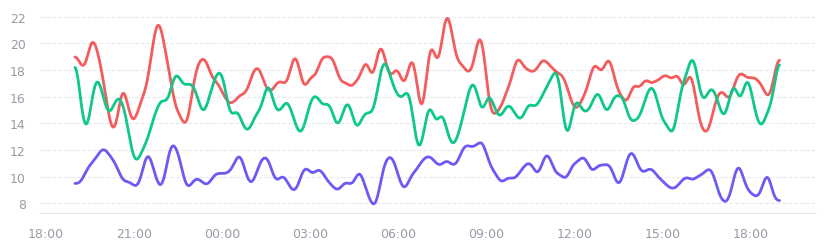
We can also just generate a bunch of random data points and smooth them out with a moving average window. It looks more convincing, but it still misses the mark. The problem is that real metrics have distinct behaviors. A moving average of random noise doesn’t give you the periodicity that a server load average has, for example.
To have more control over the shape and periodicity of the generated data (beyond what a single sine wave can offer), we can use Fourier series. At its simplest, this is just multiple sine waves added together, each with different frequencies and phase shifts:
y = sum(AMPLITUDES[i] * sin(FREQUENCIES[i] * x + PHASES[i]) for i in range(N))If we take this approach and layer it onto the random data points we discussed earlier (to simulate noise), we finally get something that looks like real-world telemetry. It has the “noise” of a live system and the “rhythm” of recurring tasks.
The math is beautiful, and it makes for some very convincing demo dashboards. But for our actual engineering needs, it’s a dead end.
The first problem is realism. Fourier-based generation looks plausible at a glance, but it assumes every metric oscillates periodically. That isn’t true. Disk usage doesn’t fluctuate like a wave, it’s a monotonic increasing counter. Latency under normal conditions is mostly flat. CPU idle time has a rhythm, but free memory doesn’t. There are distinct underlying topologies that a sum of sine waves simply can’t express.
The second problem is control. The Fourier approach has a lot of randomness baked into it: pick different seeds or parameters and you get a completely different signal. That’s fine for demos. For testing, it means you lose the determinism and expressiveness we talked about earlier. While testing our alert evaluation engine, we need to know exactly when a metric will cross a threshold — not approximately, not on average, exactly.
We need the ability to specify what happens and when it happens, and for the simulator to understand the underlying nature of the metric it’s targeting.
Decomposing a signal
To build something that actually works for testing, we had to rethink what constitutes a signal. Every metric is essentially a composite of three distinct layers:
- Underlying model: Baseline behavior of the metric. If you used a machine learning model like Prophet or TimesFM to predict a metric, this is what the model will actually learn. Each metric has its own underlying model: For CPU or request rates, it’s a daily cycle—peaking during business hours and tapering off at night. For disk usage, it’s a monotonic increase. For latency, it might be a flat, stable line.
- Noise: Real life is messy and unpredictable. There are fluctuations in traffic, measurement errors, and minor jitter. This is the random variance that makes a chart look real.
- Events: Anomalies, spikes, dips, sudden changes that break the pattern. A spike in CPU usage due to a traffic surge, a drop in disk usage after a cleanup, a sudden increase in latency from a failing component.
Models
Models are quite diverse. We can have bounded oscillators for things like CPU usage. We can have monotonic counters that increase with time and represent things like disk space.
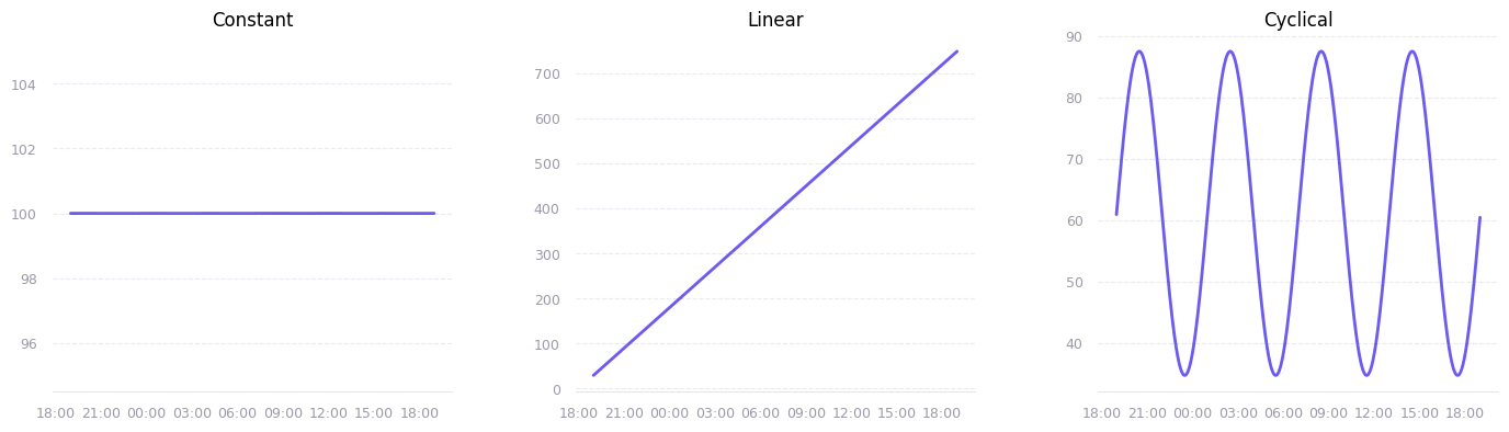
But the general topology can be quite simplified. We can represent all models with one of the following:
- Constant: Represents a metric that is constant over time (total RAM installed, total disk size, etc.)
- Linear: grows at a constant rate (disk used space, request count, etc.)
- Cyclical: sine wave pattern with a peak every N hours, either because of peak hours or just a recurring task/event (CPU usage, RAM usage, etc.)
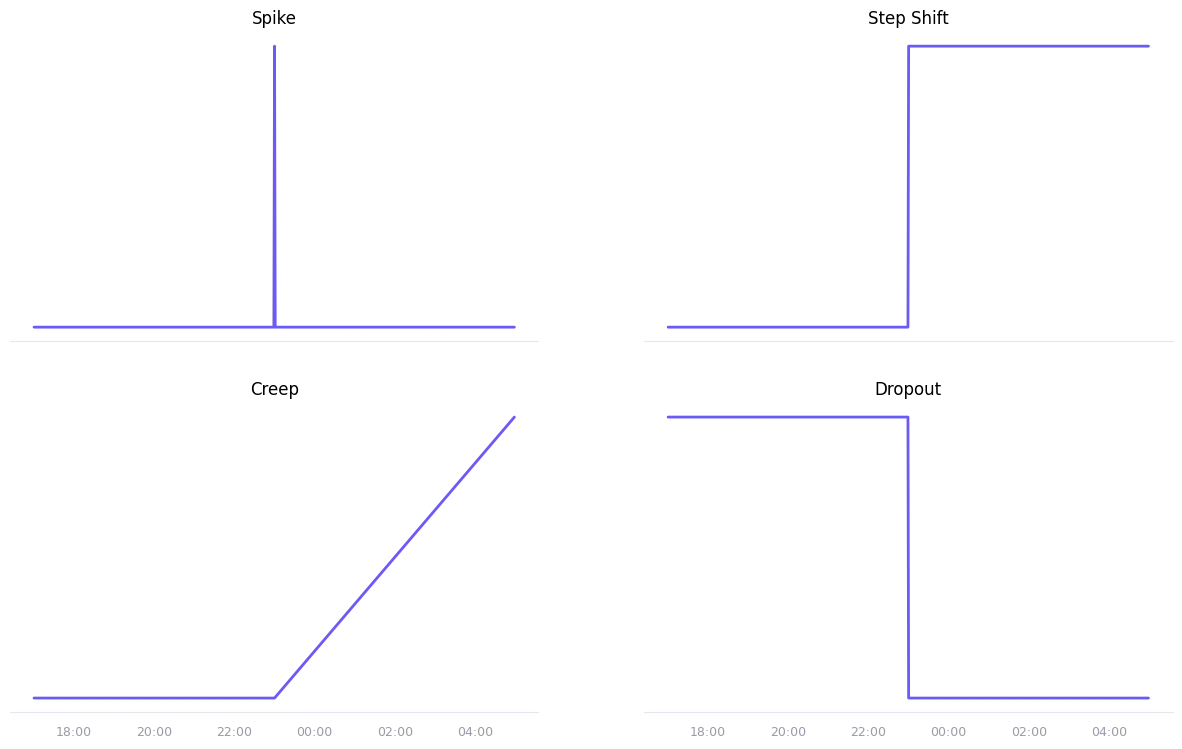
Scenarios
In the same way, scenarios can also be grouped into a few topologies:
- Spike: A Dirac delta function, used to represent a sudden change and a return to the baseline.
- Step shift: A step function, used to represent a sudden change that persists over time.
- Creep: A slow, linear drift away from the baseline.
- Dropout: A persistent drop in the metric, suddenly falling to zero.
Putting it all together
Putting our whole pipeline together, we get the following representation:
def simulator(t):
  value = model(t)
  value += noise(t)
  value = scenario(value, t)
  value = clamp(value, bounds)
  return value
We add a clamp function to make sure the value stays within the bounds of the metric. This modeling approach gives us a lot of flexibility in how we generate metrics.
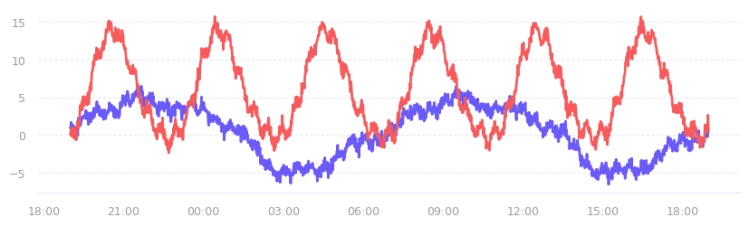
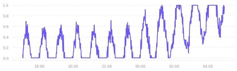
The first chart below was generated using a cyclical model with a one-hour period and a half-amplitude baseline, combined with a creep scenario that kicks in halfway through the time window, slowly pushing the values upward. A small amount of Gaussian noise and a ratio-based clamp keep the output within realistic bounds.
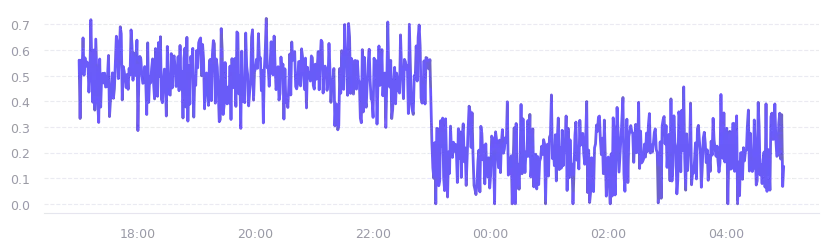
The second chart swaps the cyclical model for a constant baseline, and replaces the creep with a step shift that drops the signal by 30% halfway through the window. Think of it as a metric that was stable, then something changed abruptly. A process restart, a config change, a cleanup job that freed up space. The constant model keeps the baseline flat so the step is clearly visible against the noise.
What’s next
With three model types, four scenario types, and a noise layer, we can already compose a large range of realistic signals: cyclical CPU with a creep, flat memory with a step shift, linear disk with a spike. The next post will cover how we wired this simulator into our existing query language so it automatically picks the right model for each metric, without any manual configuration.
Simple Observability is a platform that provides full visibility into your servers. It collects logs and metrics through a lightweight agent, supports job and cron monitoring, and exposes everything through a single web interface with centrally managed configuration.
To get started, visit simpleobservability.com.
The agent is open source and available on GitHub